London Kerning
Typographic Perambulations around a City That Remembers
A book about London’s typographic past, present—and shaky future

London Kerning, 76 pages, published February 2018; sold out. Ebook edition available as a free download (PDF).
The print edition is sold out. You can download the free ebook version (PDF).
For over 500 years, the center of financial and judicial power in England has grown and remained in and near a square mile of buildings called the City of London. And at the heart of it is arguably the art of printing. From a modest start in a small shop founded by Wynkyn de Worde near Fleet Street and Henry VIII’s Bridewell Palace, printing’s importance in the City grew ever larger. It cemented London as the center of empire during expansion, and the center of media and money in the modern era.
Join author Glenn Fleishman’s jaunt around London, visiting collections and meeting printers, designers, archivists, historians, and contemporaries — and especially examining and discussing the work of type designer Berthold Wolpe (1905–1989), who helped shape the face of lettering in London. This book looks at the charm of the present and the uncertain future of London’s legacy of printing.
Update (June 2022): One of the things I feared in researching this book has come to pass. The Type Archive, which I spent many hours at during my visit in 2017, has been forced to give up its building and its collections are heading into storage far from London. Here’s my write up of what I found out.
The History of London’s Printing Past Told Through the Present
In this book, I walked (and took the Underground, the Overground, and more) to find London’s history of type and letterpress printing. Here’s what you’ll find inside…

Early drawings of Albertus by Berthold Wolpe
I know that face: Berthold Wolpe
Type designer Berthold Wolpe’s fame comes most broadly and prominently from his typefaces, notably Albertus, mostly designed in the 1930s. After that, he worked focused almost entirely on lettering and calligraphy, and teaching, studies, and writing related to it. I recount his life, describe his faces, and document a remarkable exhibition of his work in 2017 at The Type Archive.

Early drawings of Johnston, used by London’s transit system.
Johnston and Albertus: the faces of London
London feels lIke a cIty of type. This is in part because of the remarkable prescient exercise in branding that the Underground and London-area buses engaged in starting in 1916 with bold, clean symbols and their own typeface, Johnston. Albertus came later, but became the City of London’s signage face and crept into the general consciousness as part of London, with it found everywhere.

A mould or matrix used to cast display-sized metal type
The Type Archive
The Type Archive collects the typefounding history of England all in one place: Monotype hot-metal composition and casting, DeLittle’s wood type patterns, and the archives of Stephenson Blake for metal type, punches, and other material. Not broadly open to the public, The Type Archive hosted the Wolpe exhibition in 2017, and I got a thorough tour of its treasures by Sue Shaw, now passed. (The Type Archive announced its closure in mid-2022.)

Historical type punches used to make moulds from which type was cast
St Bride Printing Library
The St Bride Foundation's Printing Library contains work collected over 130 years, starting with a remarkable collection acquired intact in 1890 from the estate of Williams Blades. St Bride once taught printing off Fleet Street, but the library remains, full of books and papers important to the history of printing, journals and archives, drawings and materials from Eric Gill and others, and punches, moulds, and other artifacts. It also operates a letterpress studio, offering classes.

Some of the Doves Press type recovered from the murky depths of the Thames
Type designers in London
Meet three type designers. Robert Green’s Doves Type is a remarkable effort that led to the recovery of metal type thought to be drowned in the Thames. Toshi Omagari of Monotype, who created the revivals of Wolpe’s work, is a prolific designer at the current incarnation of a historic English type company. And Jeremy Tankard is also prolific: he’s created dozens of typefaces over a couple of decades, and has produced some beautiful specimen books of his work.
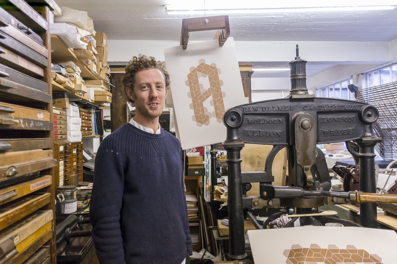
Richard Ardagh at the New North Press
Letterpress printers in London
Most of the independent letterpress shops still extant in London are part-time or operating for somewhere just above the love of the craft — some commercial work produced, and some teaching of workshops, students, or apprentices. I detail three studios in the book: Hand & Eye Letterpress, New North Press, and the Counter Press.

A spot of afternoon tea at Fortnum & Mason
About the author
Glenn Fleishman considers himself a recovering typesetter, in that he was trained in the profession during the end of the phototypesetting era, as one of the last wave of people to work solely in that capacity. He worked as a typesetter and graphic designer through his college years to help fund his degree in art from Yale University. He left Yale for the Kodak Center for Creative Imaging in Maine in 1991.
Glenn went on to co-found Point of Presence Company in 1993, one of the first Web hosting and development firms; to work at Amazon as employee #104 or so in 1996–1997; and ultimately to shift to freelance reporting and how-to book and article writing for publications that include the Economist, the New York Times, Wired, Macworld, Fast Company, Increment, American History, Boing Boing, and many others.
In 2017, he became the first designer in residence at Seattle’s School of Visual Concepts, getting back up to speed in letterpress printing, and then designed and printed a book of his reporting on type, printing, and language. He spent the year writing about, researching, and talking about historical and contemporary printing and related fields, which culminated in visiting London and writing this book. You can read more of his work and thoughts at his blog.